
Better user experience and responsive web designs are terms that go hand-in-hand. With the popularity of software web and mobile app development over the years, we see our mobile technology getting increasingly sophisticated. This increase has, in turn, boosted the need for responsive web applications to meet the end-user expectations on various devices.
How does a responsive web app or design work? You do not need different software for your specific devices for various screen sizes. Responsive web designs have significantly dropped prices and allow for better content sharing.
What Are Responsive Web App Designs?
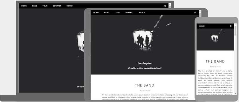
Responsive web design (aka RWD design) is a design approach that responds positively to a user’s screen environment: size and orientation. With a responsive website, someone can browse your website from any device, and it will still look and function perfectly.
The practice consists of a mix of flexible grids and layouts, images, and intelligent use of CSS media queries. Let’s say that a user switches from a laptop to an iPad; the website should automatically switch to the new medium, accommodating the resolution, image size, and scripting abilities of the new screen.
While we are at it, it is also important to note that user preferences matter here too. A gadget switch should not block the website’s access on the new device if the user has VPN on the latest gadget.
Why Is Responsive Web Design Important?
There was a time when people only accessed websites from a desktop computer. The vast majority had the same size monitor. Websites were designed for the average visitor.
Today, people access websites from various devices with screens ranging from a few inches up to 27″ or more, and expectations have changed. Consumers expect the website they’re visiting to know they’re using a tablet vs. a PC. They expect the site to adjust to them—not the other way around.
Features of Responsive Web App Designs
Strictly speaking, responsive websites have three defining features:
- Media queries
A media query allows developers to target certain device classes and inspect the physical characteristics of the device rendering our work.
Media queries allow developers to use condition checks to alter web designs based on the properties of the user’s device. This is superior to defining breakpoints in HTML/CSS, as it’s a more tailored experience for the user.
- Fluid grids
When flexible grids are created using CSS, the columns automatically rearrange themselves to fit the size of the screen or browser window, whether the user is on a 21-inch desktop computer, a 13-inch laptop, a 9.7-inch tablet, or a 5.5-inch mobile phone.
This enables designers to maintain a consistent look and feel across multiple devices. Plus, it saves everyone time and money by allowing designers to update one version of the website versus many.
- Flexible visuals
Fluid grids, flexible images, and media queries are the three technical ingredients for responsive web design, but it also requires a different way of thinking. Rather than fixating our content on disparate, device-specific experiences, we can progressively use media queries to enhance our work within different viewing contexts. A simple rule of thumb should be: As the flexible container resizes itself, so should the visual within it.
Given that over 8.48 billion unique devices exist today, this functionality allows teams to create timeless designs capable of adapting to any device, regardless of its size or shape.
These three types of functionality allow designers to craft responsive websites and apps.
Does My Website Have Responsive Design?
- Open Google Chrome
- Go to your website
- Press Ctrl + Shift + I to open Chrome DevTools
- Press Ctrl + Shift + M to toggle the device toolbar
- View your page from a mobile, tablet, or desktop perspective
Pros and Cons of Responsive Web Design
Here are some of the advantages and disadvantages of responsive web design:
Pros of Responsive App Design:
Lowers Production Cost:
If you are creating a product from scratch, a responsive app design website will be more cost-effective than sole mobile app development. Responsive and lightweight frameworks such as foundation or bootstrap make it simple and easy to create a web app that looks great and commendable on any screen size. Besides, you can target desktop and mobile app users with one source code.
Provide Cross-Platform Accessibility:
The mobile responsive web app uses CSS and HTML to show pages, which can easily be accessed from any device’s browser. So responsive app design works equally on different devices and platforms. You also don’t need to install anything on your device as the target software application is already available on the cloud, ready to be served via URL. With responsive app development, you can kill two birds with one stone.
Reduces Marketing Time:
The product teams don’t need to go through approvals of the Google Play or App store using responsive designs. The development time is reduced to almost 50% as there’s only one code base to edit and modify. Thus, if you want to change the website design, you can update the code, and changes will be automatically visible to your users. Now you know why almost every MVP application is built-in web technology.
The Content is Shareable:
The best thing to consider about responsive web apps is that they make it simple for users to link and share content. All you have to do is to copy and paste the URL to make a specific page shareable to the other users.
Google indexes content:
Your website content gets ranked in search results, empowering relevant customers to discover your product.

Cons of Responsive Design:
Requires an Internet Connection:
The responsive website cannot work offline. Moreover, users will need constant connectivity to use the website. So for this, you need to optimize the content for mobile so that your web application works fine even with limited internet connectivity. On the other hand, animated effects and high-resolution images should be adjusted for mobile devices.
Limited Native Devices Supporting Features:
Responsive websites offer limited support for mobile devices’ native features like push notifications, biometrics, gyroscope, etc. Furthermore, you can implement a native look into your web application, but for the same, you’ll be relying on an additional wrapper code that will further reduce the application performance.