User interface/user experience, or UI/UX, is essential for a website or mobile app’s success in the digital era. An immersive experience that keeps people interested and entices them to explore more can be produced by well-designed UI/UX. On the other hand, a UI/UX that could be better designed might cause confusion, frustration, and, ultimately, a high bounce rate. You must avoid these 5 UI/UX mistakes if you want your website or app to keep users scrolling.
Faulty navigation
An integral part of UI/UX design is navigation. Your website or app’s navigation should be simple to use, clear to understand, and consistent throughout all pages. Labels for navigation menus should be meaningful and descriptive, and they should be in a prominent spot. The navigation menu’s layout should be obvious, with divisions and sub-sections appropriately arranged.
More complexity in navigation is one of the most frequent errors. Users will rapidly lose interest and hunt for an alternative if the navigation needs clarification. It would help if you tried to design a navigation menu that makes it easy for users to find what they want.
Hiding key pages or features behind many clicks is another navigational error. Important sites or components should be accessible for users with just one or two clicks. Users may become dissatisfied and leave your website or app if they must click several times to find what they are looking for.

Not considering User Feedback
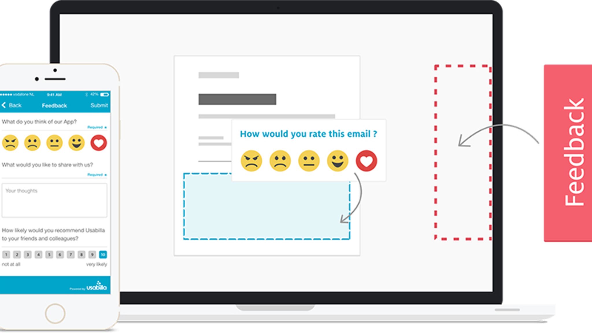
Ignoring customer input is a serious error that many companies commit. Your website or app can be improved using user feedback, an excellent data source. Users can comment on your website or app’s appearance, usability, or content. You can enhance the user experience, raise engagement, and expand your business by reviewing and acting on customer feedback.
Including a feedback form on your website or mobile app is the most straightforward approach to getting customer input. The feedback form should be concise and user-friendly and encourage users to offer detailed comments. Someone can also gather the information through surveys, emails, and social media.
After gathering customer input, you should examine it and take appropriate action. Prioritize the most urgent problems, and inform users of any adjustments you make in response to their comments.
Having Too Much Information
A typical UI/UX error is information overload. Users overwhelmed with information may need help finding what they are looking for. Due to their limited attention spans, users are unlikely to read through lengthy material passages.
To prevent information overload, it would be best to be concise and precise with your material. Use headings, subheadings, and bullet points to break up long paragraphs of text. Keep your design simple and clutter-free, and use images and videos to communicate information visually.
Setting content priorities is an additional means of avoiding information overload. Decide what information is most crucial, and display it prominently. Supplementary data should be down the page or on different pages.
Disregard for Accessibility
The importance of accessibility in UI/UX design is sometimes underrated. Designing your website or app to be used by persons with disabilities or impairments is known as accessibility. A poor user experience might result from accessibility issues for people with disabilities or impairments.
You should adhere to accessibility standards and guidelines to prevent accessibility errors. A Web Content Accessibility Guidelines (WCAG) provides a framework for creating accessible websites and apps. Alt tags for photos, video transcripts, legible fonts, and color contrast that complies with accessibility guidelines are some examples of accessibility features. Usage of these accessibility features is frequent while developing a website. Also, you have to offer keyboard shortcuts for navigation and guarantee that your design is mobile- and responsive-friendly.
Missing out on Mobile Optimizing
It’s crucial to ensure that your design is suited for mobile devices, given the rising popularity of mobile devices. Mobile optimization is necessary if you want mobile users to interact with your website hassle free.
You should prioritize mobile design right now to prevent mistakes with mobile optimization. Use responsive design to ensure your website or app responds to various screen sizes and orientations. Avoid utilizing large photos or videos in your format, as they may increase the download time on mobile devices. Instead, keep it basic. By employing shorter paragraphs, larger fonts, and mobile-friendly layouts, you should also optimize your content for mobile devices.
Conclusion
An essential element of any successful website or app is the UI/UX design. You can design a user experience that keeps your followers browsing and interested by avoiding these 5 UI/UX blunders. With careful preparation and execution, pitfalls like poor navigation, disregarding user feedback, information overload, ignoring accessibility, and ignoring mobile optimization we can easily avoid all of this.
Prioritize usability and user feedback throughout the design process to build a UI/UX that keeps your fans browsing. Evaluate user behavior and input frequently to spot problem areas and implement fixes. You may develop a seamless and engaging user experience that keeps users interested and return for more with a well-designed UI/UX.


