

The significance of UI/UX design cannot be overstated, as it can be a differentiating factor between the success of an application and its failure to leave a lasting impression—or, worse, leaving a negative impact on users. In creating top-tier web or mobile apps, even the minutest details hold paramount importance. Hence, we are eager to share insights into prevalent UI/UX design Mistakes and methods to to avoid such mistakes. Awareness of these blunders proves to be invaluable for those embarking on their design journey.
What is UI/UX design
UI/UX design refers to the process of designing user interfaces (UI) and user experiences (UX) for digital products or services. UI design focuses on the visual aspects of the interface, such as layout, typography, color schemes, and interactive elements. It aims to create visually appealing and intuitive interfaces that facilitate user interaction with the product.
UX design, on the other hand, is concerned with the overall experience of the user when interacting with the product. It encompasses aspects such as user research, information architecture, usability, and interaction design. UX designers work to ensure that the product is easy to use, efficient, and enjoyable for the users.
In essence, UI/UX design involves creating interfaces that not only look good but also provide a reliable and satisfying experience for the users, ultimately aiming to meet the needs and expectations of the target audience.
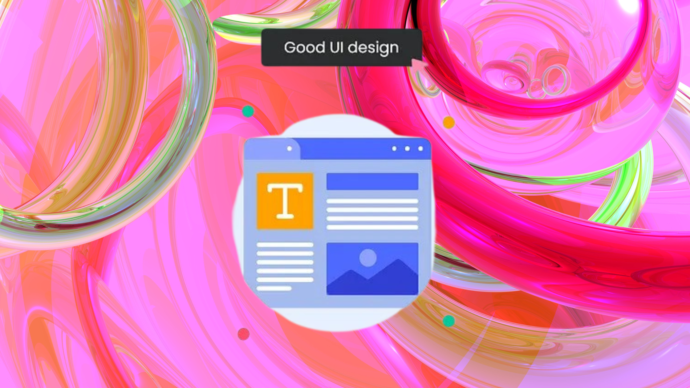
Avoid These Common UI/UX Design Mistakes for Soaring Conversions
Let’s talk about 11 things you should be careful about when designing your website or app. If you make these UI/UX design mistakes, it could hurt your chances of getting more people to use your product. But don’t worry, we’ll also talk about how to fix them.
1. Inconsistent UI/UX Elements:
Consistency is the main key in UI/UX Design. Using consistent design elements throughout your product helps users understand and navigate it more easily. Using different fonts, colors, and design elements causes confusion and weakens the user experience. Consistency builds trust and makes navigation easier for users.
- Maintain a uniform color palette across elements like buttons, text, links, headers, footers, and hover states.
- Adhere to consistent font styles for titles, paragraphs, and links.
- Opt for rounded or square corners for shapes such as icons, cards, and buttons.
- Ensure uniform line thickness for icons, dividers, and other lines.
- Any deviation from consistency should be justified by purpose.
2. Using drop shadows as the default option:
Less is more when incorporating drop-shadows. Overuse leads to a more cohesive design. If deemed necessary, adhere to these guidelines:
- Avoid using default drop shadows; customize them instead.
- Make drop shadows subtle; use a darker shade of the background color instead of stark black for a more natural look.
3. Unclear distinction between primary and secondary buttons:
In UI/UX design, having an unclear distinction between primary and secondary buttons refers to a situation where users cannot easily differentiate between the main action they need to take (primary) and the secondary actions available to them. This lack of clarity can lead to confusion and frustration among users, ultimately impacting their experience negatively.
When there’s an unclear distinction between these two types of buttons, users may hesitate or make mistakes in choosing the appropriate action. This can result in unintended consequences, such as submitting incomplete forms or deleting data accidentally.
To distinguish between primary and secondary buttons:
- Ensure that primary buttons are visually prominent, utilizing cues such as color, size, or placement to make them stand out.
- Visually differentiate secondary buttons to indicate their lesser importance compared to primary actions.
- Maintain consistency in button styling across the interface to help users recognize and understand their functions more easily.
4. Lack of clear hierarchy in text.:
The mistake of having a lack of clear hierarchy in text refers to a situation where the importance and organization of textual content within an interface are not effectively communicated to users. This can lead to confusion, and difficulty in understanding the information presented. When icons are of poor quality, it can lead to several negative consequences:
Consider the following guidelines:
- Use size, weight, and color differentiation to ensure stark contrast between different text styles.
- Initiate with prominent titles followed by progressively smaller sub-headers and text blocks.
- Implement adequate spacing and kerning to enhance readability.
- Clearly separate text blocks to show relationships between information.
5. Poor quality icons:
Icons play a vital role in communicating functionality, guiding user interactions, and enhancing the overall user experience. The mistake of using poor quality icons refers to the inclusion of icons within the interface that are visually unclear, unrecognizable, or aesthetically unpleasing.
Take into account the following guidelines:
- Utilize vector graphics or SVG for icons to ensure sharpness across devices.
- Maintain consistency in style, whether outlined or filled, along with uniform line thickness and corner radius.
- Ensure icons communicate their intended message.
6. Misaligned Elements:
Another mistake in UI/UX Design having misaligned elements refers to a situation where various interface elements such as text, buttons, images, or other visual components are not properly aligned with each other or with the overall grid structure of the interface. Misallignment can significantly impact the overall aesthetics, usability, and user experience in several ways:
Embrace the following tip for alignment:
- Consistently align related elements to the same side to establish visual cohesion and connectivity.
- Use Grid Systems
- Utilize Alignment Tools
- Conduct Regular Reviews

7. Insufficient Contrast:
Another UI.UX design mistakes is Insufficient Contrast. It refers to a situation where there is not enough differentiation between elements or text and their background, making it difficult for users to perceive and interact with the content. Insufficient contrast can lead to various issues that affect the usability and accessibility of the interface.
Consider the following contrast-related guidelines:
- Leverage contrast to direct user attention, particularly for calls to action.
- Utilize contrast to demarcate distinct sections of the app.
- Ensure sufficient contrast between elements and their backgrounds to facilitate legibility.
8. Confusing forms:
In UI/UX design, the issue of confusing forms arises when the design and layout of input forms within an interface fail to provide clear guidance or structure, leading to user confusion and frustration during data entry..
Follow these recommendations for effective form design:
- Don’t depend solely on color to indicate errors; provide descriptive feedback to help with correction.
- Break down longer or more complex forms into smaller
- Ensure consistency in the formatting, styling, and placement of input fields throughout the form to create a cohesive and intuitive user experience.
9. Touch targets on mobile devices that are too small:
In UI/UX design for mobile devices, the issue of touch targets being too small refers to interactive elements such as buttons, links, or menus that are difficult for users to accurately tap or touch with their fingers.
To avoid the mistake of having touch targets that are too small in UI/UX design for mobile devices, designers should:
- Provide enough spacing between touch targets to prevent accidental taps on adjacent elements and to reduce the likelihood of user errors.
- Maintain touch targets of at least 45-57 pixels width to mitigate accuracy concerns.
- Place important touch targets within the comfortable reach of users’ thumbs, especially for one-handed use, to enhance accessibility and ease of interaction.
- Offer visual feedback when users tap on touch targets to confirm their selection and reassure them that their action was successful.
10. Utilization of Irrelevant or Low-Quality Images:
The most important UI/UX design mistakes are using irrelevant or low-quality images. It refers to the inclusion of images within the interface that either do not serve a meaningful purpose or fail to meet the desired standards of visual quality.
Consider these guidelines when selecting images:
- Select images relevant to the app’s theme or purpose.
- Prioritize high-quality images to maintain visual integrity.
- Opt for authentic and creative imagery while eschewing staged or artificial stock photos.
11. Making It Difficult to Get Help
We LOVE a good hunt to find support on a website/app — Said no one ever. Offering visitors quick ways to connect with your support service is the minimum of a decent user experience.
It’s a big UI/UX design mistakes if you forget to provide it on your landing pages/ mobile app pages, and customers must hunt for them on every page. For example, some companies need help contacting customer support for the return/exchange of products. In that case, it takes multiple tries for customers to find a way to connect with support and resolve their issues. Customers value their time more than anything and expect brands to do the same.
How to avoid this UI/UX Design mistake:
- You can help your customers reach out to you in many ways in case they need help. For example,
- You can use a live chat widget on your website so that it’s always visible and accessible to your customers.
Self-help is a big trend; companies use tools like ProProfs Knowledge Base with an answer library for all customer queries. It helps them resolve minor issues whenever they want without depending on customer support.
Final Verdict
UI/UX design is super important for making apps or websites successful. By paying attention to small details and avoiding common UI/UX design mistakes like inconsistent design or hard-to-use forms, designers can ensure users have a great experience. So, it’s all about making things easy and enjoyable for people to use!
With the cutting-edge UI/UX services from Canadian Software Agency, elevate your online presence. We build user experiences that are smooth and captivating, from intuitive interfaces to engaging designs. Together, let’s design an amazing experience for your users.