

Having a responsive web design is no longer an option but a necessity. With so many devices out there, like smartphones, tablets, and desktop computers, people now expect a smooth and consistent experience no matter what screen size they’re using. This expectation is the cornerstone of the best practices for responsive web design, this makes sure that a website adjusts smoothly to different screen sizes, providing the best user experience at all times.
Responsive web design is an approach to creating web pages that provide an optimal viewing experience across a wide range of devices. This article delves into the key aspects of responsive web design, discussing best practices and initial considerations to ensure your website is user-friendly and effectively meets its goals.
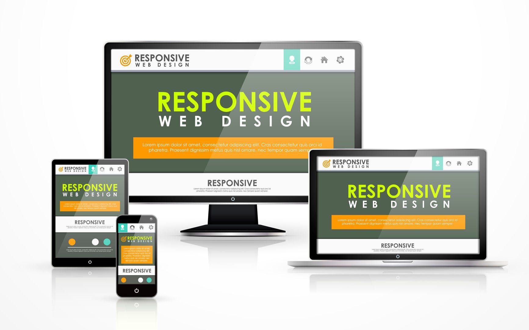
What is Responsive Web Design?
Responsive design is a method in web development that allows a website to respond to and adapt based on the device and screen size the visitor uses. This approach employs a mix of flexible grids, layouts, images, and an intelligent use of CSS media queries. The primary objective of responsive design is to create web pages that look and function well on devices of various sizes and orientations without the need for multiple versions of the same site.

Best Practices for Responsive Web Design
Creating a responsive design is a multifaceted process that involves strategic planning and a deep understanding of how users interact with websites across different devices. Here, we outline the best practices for responsive web design to help you build an adaptable and user-friendly website.
Understanding Your Audience and Setting Website Goals
Analyzing Target Audiences and Their Devices
Understanding your target audience is crucial in any design process, and it’s no different for responsive web design. Analyzing the devices your audience uses to access your site will guide your design decisions significantly. This analysis involves:
- Device Usage Statistics: Use tools like Google Analytics to gather data on your visitors’ devices.
- User Behavior: Observe how different audience segments interact with your site on various devices. It includes click patterns, time spent on pages, and bounce rates.
- Context of Use: Consider where and how users are accessing your site. For example, users on mobile devices might be on the go and looking for quick, accessible information, while desktop users might be more inclined to engage in detailed browsing.
Defining Goals and Priorities for the Website
Before diving into design, it’s essential to define the primary goals of your website and prioritize them based on user needs and business objectives. This step involves:
- Identifying Key Functions: Determine the core functionalities and content your site must deliver effectively across all devices.
- Setting Priorities: Rank these functions and content elements by importance, ensuring the most critical aspects receive prominence on all screen sizes.
- Balancing User Experience and Performance: Aim to create a design that offers a smooth user experience while maintaining performance efficiency, particularly on mobile devices.
Wireframing and Prototyping
Tools for Creating Wireframes
Wireframing is a fundamental step in responsive web design, serving as a blueprint for your site’s structure. Wireframing tools can assist in creating wireframes that adapt to different screen sizes:
- Sketch: A vector-based design tool popular among UX/UI designers for creating responsive wireframes and prototypes.
- Adobe XD: Provides comprehensive tools for designing, prototyping, and sharing wireframes and interactive prototypes.
- Figma: A cloud-based design tool that allows real-time collaboration and has robust features for creating responsive wireframes.
Importance of Mobile-First Design
A mobile-first approach is a strategy where the design process starts with the mobile version of a website and then scales up to larger screens. This approach has several advantages:
- Focus on Core Content: Designing for smaller screens forces you to prioritize essential content and functionalities, leading to a cleaner, more focused design.
- Performance Optimization: Mobile-first design encourages optimization from the outset, ensuring your site performs well on less powerful mobile devices.
- Ease of Scaling Up: It’s generally easier to scale up a design from mobile to desktop than to scale down, ensuring that your design remains effective and user-friendly at all screen sizes.
Content Strategy
Prioritizing Content for Different Screen Sizes
Content is king, but how it is presented across different devices is crucial. A robust content strategy for responsive web design involves:
- Content Hierarchy: Establish a clear hierarchy of content that adapts to different screen sizes, ensuring the most critical information is always easily accessible.
- Adaptive Content Delivery: Use techniques such as progressive enhancement to deliver content that adjusts based on the user’s device capabilities.
- Consistent User Experience: Maintain a consistent tone and style across devices, providing a unified experience regardless of how users access your site.
Ensuring Content is Accessible and Legible on All Devices
Accessibility is a key component of responsive web design. To ensure that your content is legible and accessible:
- Readable Fonts: Use scalable fonts that maintain readability on small and large screens. Consider using relative units like ems and rems for font sizes.
- Contrast and Color: Ensure sufficient contrast between text and background to improve readability. Follow WCAG guidelines for color contrast.
- Responsive Typography: Implement media queries to adjust font sizes and line heights based on screen size, ensuring an optimal reading experience.
Design Principles
Mobile-First Approach
Adopting a mobile-first approach can significantly enhance the usability and performance of your website. Here’s how to effectively implement this strategy:
Advantages of Starting Design from the Smallest Screen
- Prioritization of Content: By focusing on the most important content first, you avoid clutter when scaling down from a desktop design.
- Enhanced Performance: Mobile-first design often leads to faster load times and better performance on all devices, as it encourages using lightweight design elements.
- User-Centric Design: With the increasing use of mobile devices, starting with a mobile-first approach ensures that most users have a positive experience.
Techniques for Scaling Up Design
- Progressive Enhancement: Start with a basic mobile design and add more complex features and layouts as the screen size increases.
- Flexible Grid Systems: Use flexible grid systems that adapt to different screen sizes, ensuring a consistent layout across devices.
- CSS Media Queries: Employ media queries to apply different styles for different devices, enhancing the responsiveness of your design.
Add Call-to-Action Buttons
Call-to-action (CTA) buttons are crucial for guiding user interaction. In responsive web design, consider the following best practices:
- Visibility: Ensure CTA buttons are prominently placed and easily accessible on all screen sizes.
- Touch-Friendly: Design CTA buttons that are large enough for easy tapping on mobile devices, following guidelines for touch targets.
- Consistent Styling: Maintain consistent styling for CTA buttons across devices to reinforce their importance and function.
Implement Responsive Images
Images play a vital role in web design but can also pose challenges in responsiveness. Implementing responsive images involves:
- Adaptive Image Sizes: Use techniques like srcset and sizes attributes in HTML to provide different image resolutions based on the device’s screen size.
- CSS Media Queries: Apply media queries to adjust image display properties, such as width and height, ensuring they fit appropriately within the design.
- Performance Optimization: Optimize images for faster load times without compromising quality, using formats like WebP for better compression.
Responsive Typography
Typography is critical to responsive web design, ensuring that text is legible and aesthetically pleasing on all devices. Key practices include:
- Relative Units: Use relative units like ems and rems for font sizes to enable scalability across different screen sizes.
- Media Queries for Fonts: Implement media queries to adjust font sizes, line heights, and spacing based on the screen size, ensuring optimal readability.
- Hierarchy and Contrast: Maintain a clear typographic hierarchy and sufficient contrast between text and background for improved readability.
Conclusion
Adhering to the best practices for responsive web design is essential for creating websites that provide a seamless user experience across all devices. By analyzing your target audience, defining clear goals, and employing strategic design and content practices, you can ensure your website remains functional, accessible, and visually appealing. The principles and techniques discussed in this article serve as a comprehensive guide to achieving an effective, responsive web design, ultimately enhancing user satisfaction and engagement.