

Most users give your mobile app less than a minute before they decide to stay or leave. They tap, swipe, wait for a second, and then judge your work. If the experience feels slow, confusing, or noisy, they do not complain. They uninstall and move on.
This is why user experience (UX) is no longer a nice extra. It is the core of product success. A clean and simple app does not just look good. It lowers support work, reduces people leaving, and turns first-time users into long-term fans.
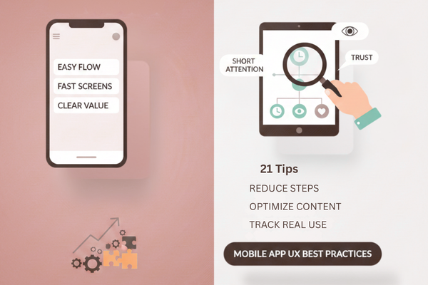
In this guide, we share 21 Mobile App UX Best Practices that help improve retention. These ideas are not a theory. They are based on patterns we use when we design and build apps for clients across many fields. You can use them if you are planning a new product or improving an existing one.
If you want users to install your app and keep it on their home screen, this guide is for you. Let us start with users.
Why UX decides if users stay or leave
Users have hundreds of apps to choose from. If yours is slow or hard to use, they will not adjust; they will replace you. Good UX cuts effort at each step, from first open to daily tasks. It also reduces support messages and bad reviews, because people can solve their needs on their own.
21 Mobile App UX Best Practices That Skyrocket Retention
Here are 21 Mobile App UX Best Practices you can start using today. Use this list as a simple checklist.
1. Make the first screen do one clear job
Show one main action on the first screen. Remove extra text and buttons so new users know what to do in one glance.
2. Keep sign-up as short as possible
Ask only for the details you must have to start. Long forms drain patience. Use email or phone, then let people fill profile details later, once they see real value.
3. Offer a guest mode when you can
When it fits your product, let users try key features without an account. This lowers fear and lets people feel the benefit before they commit to signing up.
4. Guide new users with a short, clear tour
Use a few simple cards or tooltips to explain the main actions. Keep text brief, show real screens, and always give a “skip” option for users who learn by doing.
5. Keep navigation simple and steady
Use a clear bottom bar or side menu with 3–5 main sections. Keep icons and labels in the same place on every screen so people never have to hunt.
6. Use plain, friendly language
Avoid buzzwords and complex terms. Use the same simple words your users would say to a friend. Clear copy also reduces errors, since people understand forms and buttons the first time.
7. Make touch targets large and spaced out
Buttons and links should be easy to tap without zooming. Follow platform guides for minimum size, and leave enough space between items to reduce wrong taps and user stress.
8. Design for one-hand, real-life use
Many people use phones while walking, on a bus, or with one hand. Place key actions in the thumb zone and avoid making users stretch to the top of the screen.
9. Keep layout and style consistent
Use the same colors, fonts, and button styles across the app. When patterns repeat, people learn faster and feel safe. Sudden style changes add doubt and slow them down.
10. Send useful, not noisy, notifications
Every push message should help the user, not just your goals. Let people pick what they want to hear about, and show the same options inside settings later.
11. Show clear feedback after every action
After a tap, the app should answer: loading states, success check marks, and error notes in simple words. Silent taps confuse people and make them repeat actions, which can cause wrong data.
12. Keep load time and app size under control
Slow apps lose users. Cut heavy images, limit calls to your servers, and store needed data on the device. Test on older phones and weaker networks, not only on your own fast device.
13. Design for weak or no network
Let users keep working when the signal drops. Hold actions, show offline labels, and update in the background when the connection returns. Tell people what is saved and what is not.
14. Respect system settings like dark mode and font size
Follow phone settings for theme, text size, and motion where you can. This helps users with low vision or light sensitivity and makes your app feel like part of the device.
15. Build with basic accessibility in mind
Use good color contrast, clear labels for icons, and support for screen readers. These steps help users with disabilities and also make the app easier for everyone.
16. Personalize only when it helps the user
Use data to show content, tips, or offers that match real behavior. Avoid creepy or pushy changes. Let users see and change the choices that shape what they see.
17. Make search fast and forgiving
If your app has a lot of content, clear search is key. Support short names, spelling mistakes, and filters. Show results quickly and let people refine instead of starting over.
18. Be open about data, privacy, and permissions
Ask for only the permissions you really need, at the moment you need them. Explain in plain text how data is used, and give users simple ways to manage that choice.
19. Make help easy to find
Place help and contact links where people need them, not hidden at the bottom. Use short FAQs, chat, or email forms so users can fix issues without leaving the app.
20. Test often with real users, not just your team
Watch people use early versions, either in person or on video calls. Ask them to complete real tasks and note where they pause, ask questions, or take wrong turns.
21. Let data guide, but do not forget context
Use event reports to see where users drop off or stay. But always read numbers with real stories from support and research, so you know why people behave that way.
Case study: when UX and speed work together
In one project, we used these tips to improve UX and app speed for a niche dating app. We simplified key flows, reduced friction in sign-up, and tuned performance so screens loaded faster, even on older phones. You can see the full story in this case study. It shows how thoughtful design and technical polish can work together to raise engagement and long-term retention.

Conclusion
User attention is short, but it is not random. People stay with apps that respect their time, feel easy to use, and give clear value on every visit. When you design with care, small parts of the journey add up to a strong whole. Clear text, fast screens, and calm flows do more for growth than any new feature that feels heavy or rushed.
The 21 tips in this guide are a simple playbook, not a strict rule book. You do not need to launch all changes at once. Instead, pick a few weak spots in your current app, set a small goal for each, and test again after each update. Over time, this steady work turns a basic product into one that people trust and even suggest to friends.
Focus on the areas that shape first impressions and daily habits. Reduce the steps to key actions, check that content still looks good on new devices, and keep tracking what real users do, not what you hope they do. When numbers show a drop at any step, treat it as helpful feedback, not as failure.
As you apply these Mobile App UX Best Practices, remember that tools and trends will change, but respect for the user will not. Simple, honest design beats tricks that chase short-term clicks. If you want help to review your current app flow, test performance, or plan a full UX refresh, our team can guide you through each phase and share what we have seen work in many projects. The case study linked above shows how better UX and faster load time can work together to raise engagement and retention in the real world. With the right focus, your app can move from “nice to try” to “must have” on your users’ phones every day.
FAQs
Why does UX affect retention?
Simple, fast flows keep users returning.
How often should I review UX?
Review core screens every few months.
Do I need designers for good UX?
No, small teams can follow clear rules.