
Dark Mode vs Light Mode: Which Converts Better?
Picture this: You’re browsing your phone late at night, and suddenly a bright white screen hits your eyes like a flashbulb. Annoying, right? That’s exactly why dark mode vs light mode has become one of the hottest topics in web and app design today.
In recent years, more and more companies are offering both options to their users. However, the big question remains: which one actually helps convert visitors into customers? As a software development agency, we’ve tested both modes across different projects and gathered real data about user behavior. The answer might surprise you – it’s not as simple as picking one over the other.
Conversion rates (the percentage of visitors who take action on your site) can make or break your business. Therefore, understanding how color schemes affect user decisions is crucial. Some users swear by dark mode for its sleek look and reduced eye strain. Meanwhile, others prefer the classic, crisp appearance of light mode. In this blog, we’ll explore both sides, examine the science behind user preferences, and help you decide which mode works best for your specific needs. Let’s dive into the details and discover what really drives conversions.
What Is Dark Mode and Light Mode?
Before we compare, let’s understand what we’re talking about.
Light mode is the traditional design most of us grew up with. It features dark text on a bright, usually white background. Think of regular paper books or classic websites. This has been the standard for decades because it mirrors how we read printed materials.
On the other hand, dark mode flips this around. It shows light text on a dark background, typically black or dark gray. Apple, Google, and Facebook have all added this feature to their platforms in recent years. Consequently, it has become extremely popular among smartphone and computer users.
Both options serve the same purpose – displaying information. However, they create very different visual experiences for users.
The Science Behind User Preferences
Research shows that our eyes react differently to various color schemes. Let’s break down what happens.
How Dark Mode Affects Users
Dark mode reduces the amount of light coming from screens. As a result, many people find it easier on their eyes, especially in low-light conditions. Additionally, it can help save battery life on devices with OLED screens.
However, some studies suggest that reading speed might decrease slightly in dark mode. This happens because our eyes are naturally designed to read dark text on light backgrounds – just like ink on paper.
How Light Mode Affects Users
Light mode typically offers better readability in bright environments. Furthermore, most people can read faster and with better comprehension when using light mode. This traditional format feels familiar and comfortable to many users.
Nevertheless, staring at bright screens for long periods can cause eye strain. This is particularly true during nighttime browsing sessions.
Impact on Conversion Rates
Now, let’s get to the heart of the matter: which mode actually converts better?
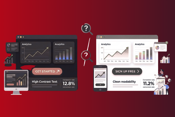
Dark Mode Performance
According to our testing and industry research, dark mode performs exceptionally well for certain types of websites. Entertainment platforms, gaming sites, and creative portfolios often see higher engagement with dark mode. Why? Because it creates a modern, premium feel that appeals to younger audiences.
Moreover, dark mode helps images and videos pop off the screen. This makes visual content more engaging and memorable. For example, our recent project showcased at Burn Your Book case study demonstrated how dark design elements can enhance user engagement.
However, dark mode isn’t always the winner. E-commerce sites selling everyday products sometimes see lower conversion rates with dark mode. Users may perceive dark backgrounds as less trustworthy for traditional shopping.
Light Mode Performance
Light mode remains the champion for many business websites. Professional service sites, healthcare platforms, and financial institutions typically convert better with light mode. This is because it conveys trust, clarity, and professionalism.
Additionally, light mode works better for text-heavy content. Blog posts, news articles, and educational materials are easier to read in traditional light mode. Therefore, if your site relies heavily on written content, light mode might be your best bet.
Studies show that older audiences (45+) generally prefer light mode. They find it more comfortable and familiar. Hence, if your target market includes older users, light mode could boost your conversions.
Key Factors to Consider for Your Business
Choosing between dark mode vs light mode isn’t a one-size-fits-all decision. Instead, consider these important factors:
Your Target Audience
Who are you trying to reach? Younger users (18-35) often prefer dark mode options. Meanwhile, older users typically stick with light mode. Understanding your audience demographics is essential.
Your Industry
Tech companies and creative agencies can pull off dark mode easily. However, banks, hospitals, and law firms usually perform better with light mode. Your industry expectations matter greatly.
Type of Content
Are you sharing lots of text or primarily visuals? Text-heavy sites work better in light mode. Visual-focused sites can shine in dark mode.
Time of Day
Consider when your users are most active. If they browse mainly at night, offering dark mode becomes more important. Conversely, daytime users might appreciate light mode more.
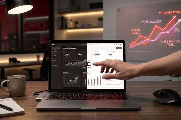
The Best Solution: Offering Both Options
Here’s the truth: the best approach is often giving users the choice.
Why Choice Matters
When you let users pick their preferred mode, everybody wins. Users feel in control of their experience. Furthermore, they’re more likely to spend time on your site when it’s comfortable for them.
Many successful websites now include a simple toggle switch. Users can change between modes with one click. This flexibility shows that you care about user experience.
Technical Considerations
Implementing both modes requires extra development work. Your design needs to look good in both formats. Additionally, all text must remain readable, and buttons must stay visible regardless of the mode.
However, this investment pays off. Users appreciate the flexibility, which can lead to better engagement and higher conversion rates overall.

Conclusion
So, which converts better – dark mode or light mode? The honest answer is: it depends on your specific situation.
Dark mode excels for visual content, younger audiences, and nighttime browsing. It creates a modern, sleek appearance that appeals to tech-savvy users. Additionally, it reduces eye strain in low-light conditions and can make your brand feel more premium and contemporary.
Light mode, however, remains the reliable choice for text-heavy content, professional services, and older audiences. It offers superior readability, faster comprehension, and a trustworthy appearance that many users prefer. Furthermore, it performs better in bright environments and feels more familiar to traditional web users.
Rather than picking one over the other, the smartest strategy is to offer both options. When users can choose their preferred mode, they feel more comfortable and engaged. This flexibility demonstrates that you value user experience, which builds trust and loyalty.
Remember, conversion isn’t just about design aesthetics. It’s about creating the best possible experience for your specific audience. Therefore, test both modes with your actual users. Track the data, measure the results, and make informed decisions based on real behavior patterns.
At the end of the day, your users will tell you what works best. Some will love dark mode’s sleek sophistication. Others will prefer light mode’s classic clarity. By giving them the choice, you maximize your chances of converting visitors into customers, regardless of their personal preferences.
The debate between dark mode and light mode will likely continue. However, businesses that focus on user experience rather than following trends will always come out ahead. Consider your audience, test thoroughly, and let the data guide your decision. After all, the mode that converts best is the one your users actually want to use.
FAQs
Q1: Does dark mode really save battery?
Yes, on OLED screens, dark mode can save up to 30% battery life since black pixels use less power.
Q2: Which mode is better for reading?
Light mode typically offers better readability and faster reading speed for text-heavy content.
Q3: Can I offer both modes on my website?
Absolutely! Many modern websites include a toggle switch letting users choose their preferred mode.
Q4: Does dark mode reduce eye strain?
In low-light conditions, yes. However, in bright environments, light mode may actually be more comfortable.
Q5: Which mode do most users prefer?
Preference varies by age and context. Younger users often prefer dark mode, while older users tend toward light mode.